Řízení letového provozu

Architecture as a stylistic problem
paper on the new center of Air Navigation Services of HungaroControl Zrt., Budapest (ANS III)
"Their houses are massive but light and not forceful and scholar. They are not humorous but spreading serenity. ... We can openly turn to these buildings and we can bite of them as much as we want, our eyes can eat a lot and appetite of our imagination comes as well." Tamás Getto Architect
Buildings, where architectural problems are particularly stylistic ones, can be considered as special examples. The recently completed new building of HungaroControl Zrt. is a building of such kind: an addition that sensitively and innovatively continues the previous phase, a house which organically fits in the creative oeuvre but at the same time becomes a unique experiment in a sense, since the way it uses a well-known material, ceramics is remarkable even in international context.
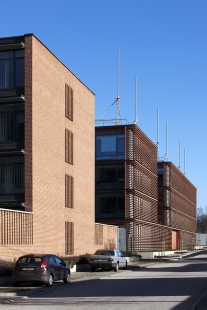
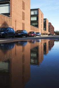
In 2004, the air control center of the Hungarian airport was placed in an exemplary building. On one hand the building of ANS II designed by Tamás Nagy applied a familiar office typology with setting up a system consisting of central corridor office wings repeated at right angle to the longitudinal bulk and the courts in between them. On the other hand the facade is clad by rustic brick tile, a material quite typical of the architect, being adjusted to his oeuvre that represents a determinant chapter in Hungarian contemporary brick architecture. Thirdly, he made the building unique with poetic, innovative tools: by using his experiment results he created glass lamellas decorated with magnified, colored bird feather patterns as a reference to aviation. The layout established an open system: the rhythm of the cross wings created a continuable structure, a kind of regularity.
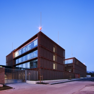
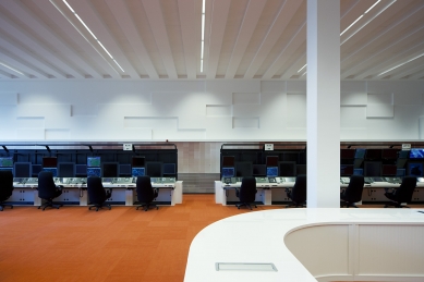
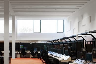
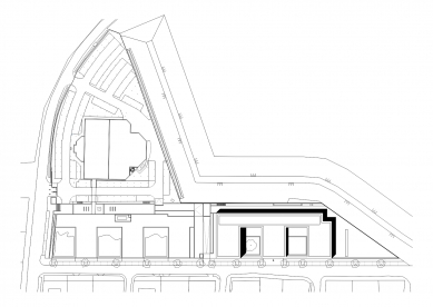
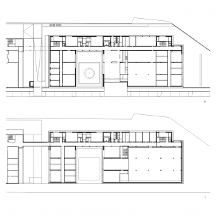
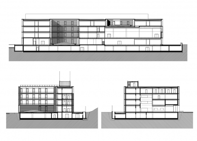
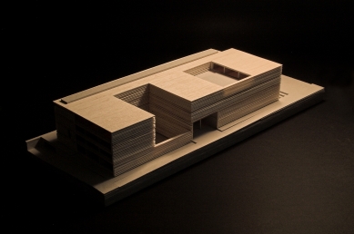
The stake of the design competition organized in 2007 for the extension of the building complex of ANS II was primarily the matter of defining the relationship with the building of Tamás Nagy. The participants of the competition tried either to continue or to counterpoint the original building to be extended: while the first ones were encumbered by the differing functional programs, latter attempts were hindered by the open layout and the strong statement of the existing house. The design of Zsolt Zsuffa and László Kalmár continued the scenario of Tamás Nagy in a way that made them able to fit this significantly different spatial program into the system determined by the previous building to be extended. Three new wings were added to the existing three blocks in a way where the last two ones - except their uppermost story - were built together: giving place to spaces with large floor area and high headroom like the air traffic control hall.
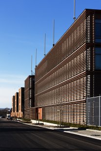
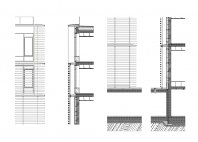
"The surroundings do not require any new architectural character, preferably the existing one needs to be reinforced." - drew up the architects in the technical description of the competition plan. Instead of brick facade cladding, the architects applied a ceramic lamella system installed on a separated load bearing structure as a secondary skin. This solution - according to their plans - took over the main characteristic of Tamás Nagy's building, namely the architectural use of burnt clay and at the same time radically reinterpreted it: the familiar connotations of brick, its massiveness, sensuality and the handcraft was replaced by the lightness, sterility and industrial style of lamellas. The relevant distance between the grey plastered wall, which can be considered as the real facade, and the ceramic shades nearly resulted in the "house in a house" effect. Associating this with the Faraday cage effect might not lead too far, it essentially means to enclose the space to be protected with metal mesh in order to shield it against exterior electromagnetic influence. Naturally, here the facade has no similar functions but at the same time – just like the allusions of the ANS II's glass feathers - it can give meaning to such a building where the function itself is actually neutral, the technology of air traffic control is strictly regulated and a neutral space structure derives from the applied office typology.
Mutation
At the turn of the 90ies and the years of 2000, the great interest arising amongst Hungarian architects towards brick architecture originated not only from the rediscovery of the building works' handcraft aspects after the regime change but it also became an important literary element of regional thinking. An important introduction of this idea was the curatorial concept of Miklós Sulyok at the Venice Biennale of Architecture in 2002 where he presented the so called regionalist architectural attitude by means of focusing on the brick architecture of István Ferencz, Tamás Nagy and Gábor Turányi.
By now, the brick architecture of Tamás Nagy has become one of the most consistent and literary coherent Hungarian oeuvre. Beside the statuesque-organic attempts, also the ornamental possibilities hidden in modular arrangement and in the use of brick as a grille, an openwork surface, nearly pushing the envelope of the brick's materiality, have led to exciting solutions. In case of the ANS II building brick appears primarily with its nature and character as cladding material, in compliance with the planar style of the facade design; and contrary to the previous examples here not its massiveness but its surface character becomes dominant. On this house brick is not a fundamental building element anymore but - beside the evident engagement of the architect - much more a solution for counterpointing the glass structure facades on the surface as much as possible.
The strong structure of ANS II representing the possibility of continuation and the distinctive use of materials created a special situation regarding the extension. Beyond giving an obvious answer, which conceivably could have been the continuation – cloning - of the original brick architecture, an exciting occasion offered the innovative reinterpretation - mutation - of both the settlement and layout structure and of the architectural appearance and meaning. The architects of ANS III have clearly chosen the latter strategy.
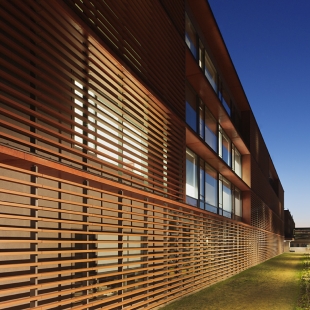
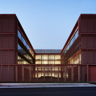
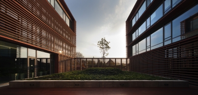
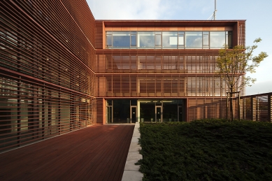
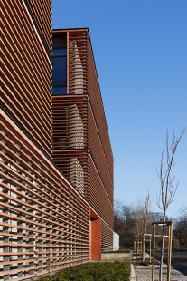
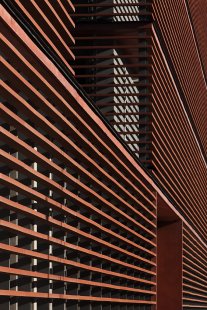
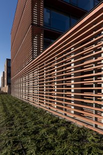
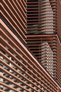
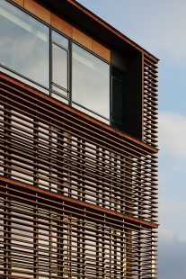
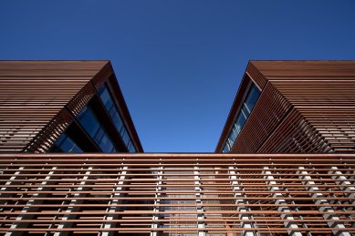
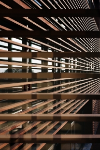
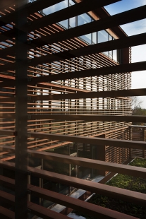
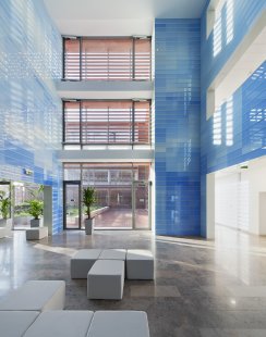
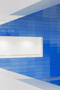
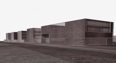
Due to the strong aura of the extended house created by the use of materials, all kind of strategies based on only a small-scale reinterpretation of brick and glass structures would presumably have weakened the independent and mutual power and stance of the two buildings. However, here we can see a transcription, since - beyond material and color - the ceramic lamellas can be compared to the lightness and transparency of the glass structures of ANS II, they continue the abstraction of its brick grid appearing on the gable and fence walls and last - but not least - express the different characters of the function behind. The lamella skin of the new building is well differentiated too: it seems massive nearly like a wall structure but behaves like a transparent, translucent membrane at the same time. Placing the rustic surfaced small brick and the perfect, precise ceramic lamellas next to each other results in a productive stress as we can see radically different usages of the same material.
Evolution
In many works of Zsuffa and Kalmár that modernist facade design tradition can be traced which is based on the distinction between solid and transparent sections placed between the slabs, in this way using the slab edges as dominant organizing elements of the facades. This concept prevails partly in case of the city hall of Budaörs from 2005, the library design competition in Pécs from 2007, many detached houses, later, in 2010 on the elevation of the beauty-shop of Hévíz and in case of many other words. The tool of projecting slab edges to the facade establishes a certain design rule that enables the realization of wide range of architectural experiments. In the sequence of the architects' works slabs separated mainly solid (stone or brick clad) and transparent surfaces. In case of the beauty-shop solely one story high glass planes were stretched between the slabs the edge of which were connected by tight-rope steel wire according to the plans, in this way providing support structure for an intense green facade.
This exciting story of architectural genesis is completed by the new building of ANS III too, where the facade itself - a new development compared to the previous ones - sat on the edge of the protruded slabs has became a totally independent element. Several aims and consequences resulted from this - already well studied and experienced - solution. On one hand - just like in other previous works of the architects - it appears as an organizing principle between solid and opened surfaces. It works as a cantilever supporting the transparent facade membrane in front of the glass surfaces behind the lamellas, similarly to the building in Hévíz: the thing which is a green facade there, here becomes ceramic lamella. The ceramic grille's surface-like effect dominates at places where lamellas do not run in front of the glass surfaces and large sized openings are placed into these surfaces. Since ceramic cage, longing for independence and covering the building, is divided by the slabs on each floor, they connect it to the interior space articulation of the building. The search for homogeneity, which was realized by the repetition of ceramic elements with small section would make the observer uncertain about the size and scale of the building. But beside the openings stretched between the slabs, the recognizable slab edges give a well known, identifiable (story high) scale to the house.
Dematerialization
The most important - though at the same time most abstract - architectural development of this building lays in the architectural effect and meaning of ceramic lamellas, which solution is not without antecedents.
On one hand the use of lamellas provides a sculpturesque/object-like interpretation since seeing from different view points, the recognized massiveness of surfaces is changing too and leads to the differentiation of surfaces. However, the lamella system is completely homogeneous and undifferentiated at the same time, this way presenting a surface-like impression too. A good example of the former case can be the Central Signal Box building of Herzog and de Meuron from 1999, where - covering the simple mass - the statuesqueness of metal cladding and its transition between solid and openwork surfaces strengthens primarily the form itself and its mass-like character, and results in an unusual, dematerializing impact. At the same time, Renzo Piano's buildings (Daimler building in Potsdamer Platz, Berlin at the turn of 2000 or the New York Times headquarter building from 2007) and their ceramic facades are approaching from the surface, since they use lamellas in their solid and open nature too in this way they project the facade behind them to the surface.
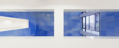
Transparent skin or mass with structured surface: these two features are present on the building at the same time. The dilemma of the design is the matter of openings: in case of spaces of typically circulation function (where shaded facade may be allowed) the lamellas run in front of the windows, but at offices with permanent working environment the ceramic shades, otherwise consistently placed everywhere around the building, are stopped. These large openings are framed with concrete rim in terracotta color, further strengthening the surface-like character of the facade skin, and in this surface windows are articulated either as openings from a "curtain" drawn aside or cut out by using elements of a certain depth.
Besides the dematerialization of mass and surface, in this case ceramic lamellas mean a radical brick facade transformation too. The facade elements refer to the building of ANS II only in their material and color; all the other connotations offer drastically different interpretations. The ceramic elements are manufactured by the German company NBK, and in this very situation the components were produced with the length of 180 cm resulting from a development done in co-operation with the architects. The span quite large compared to the cross section dimension made it possible to install the supports rarely; and by this the conceptional intention, namely aerial appearance was emphasized. The ceramic beams have an end only at places where they meet an opening, and in this way they whip round the building like a never-ending bandage. We feel this effect the strongest at spots where - looking through the lamellas of the corners or the ones running in front of the ground floor or upstairs court – due to the absence of any building facade behind the shades we can see a floating, nearly dematerialized, independent building skin. At these places the contours of the form are dissolved, the building is surrounded by a peculiar vibration.
The significance of our building lies in the fact that it steps over the constraints of Hungarian brick architecture canon with ease, but at the same time keeps relation with it. This house synthesizes, works out design experiments which have already appeared in former works of the architects, presents excitingly abstract and specific detail solutions. Watching the realized building, the opinion about the winner entry, defined in 2007 by the jury of the competition, where one of the members was Tamás Nagy, architect of building ANS II, seems to be true: "It's harmony, co-existence with the building of ANS II is balanced; in spite of or thanks to the different architectural tools the overall image is natural, the new building closes the previously started story with a sensitive counterpoint. The symbiosis is exemplary, the "age difference" can subtly be perceived - this is its main virtue: starting from the existing structure the new building changed it only to an extend and in a way that every gesture, every decision resulted in a small scaled but value-added change. Here, architecture can be practiced at a high standard only in this way."
Levente Szabó
(This paper was supported by the János Bolyai Research Scholarship of the Hungarian Academy of Sciences.)
photography: Tamás Bujnovszky
photography: Tamás Bujnovszky
0 komentářů
přidat komentář


