40 Housing Units
40 logements Saussure

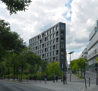
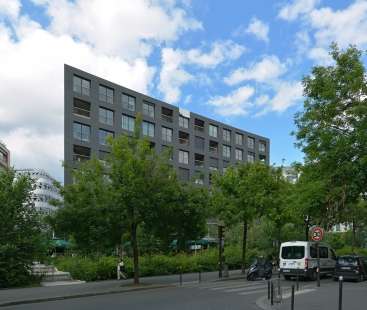
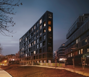
Lot 4.2 is part of the new Clichy-Batignolles mixed development area and is located at the edge of boulevard Pereire, at the meeting point of two different periods in the history of Paris’ urban development. The building plays a key role in linking these two architectural worlds.
The project renders homage to Paris and the 19th century architecture of the Haussmann building. It seeks to preserve the "intrinsic intelligence of this form," which has allowed the buildings constructed during the Haussmann period to survive many changes and grow with the city, providing multiple, often very different uses of the same building.
The Haussmann building was designed originally as a place of residence for the bourgeoisie, but it revealed itself to be an extraordinarily open architecture capable of incorporating other uses besides habitation: offices, stores, workshops, schools, etc.
There are common characteristics in all these architectures that lie at the base of this flexibility: a clear structure, a ground floor that is accessible from the street and which can extend to include the mezzanine, a wealth and variety of door and window openings to allow for the construction of all kinds of plans, variable heights in the floors, adequate thickness, and a high level of compactness.
We consider these values as the great heritage of the Parisian building, and we have sought to translate them into an architecture that forms part of the city’s current logic, but which also offers solutions to current and future challenges.
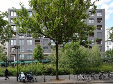
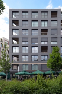
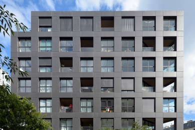
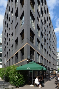
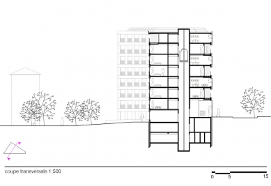
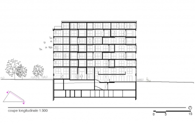
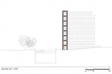
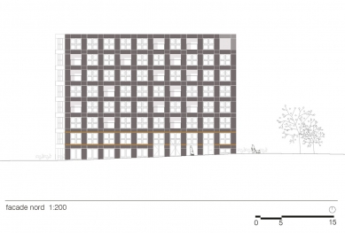
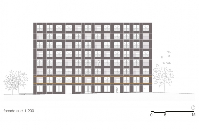
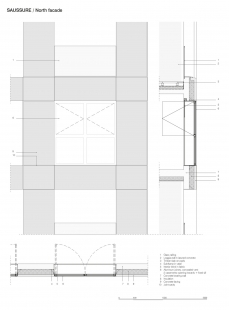
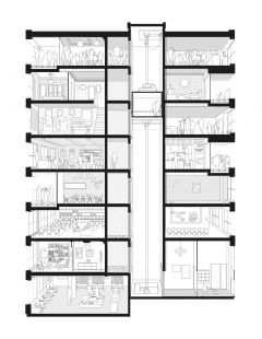
The design of the façade for Lot 4.2 uses a structural pattern similar to the office buildings (1.35 meters). It alternates one full module with two empty ones, which correspond to the window openings. Together with the core of the circulation, this ensures the building’s structure. The height between floors is 3.2 meters, halfway between the standard height for residential housing (2.8 meters) and that for office buildings (3.5 meters). The commercial ground floor includes part of the 1st floor; its slightly different treatment indicates its urban character.
The ornamentation borrows various elements from the Haussmann style, especially the horizontal stretchers that mark the piano nobile, as well as the proportion of fullness and emptiness.
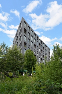
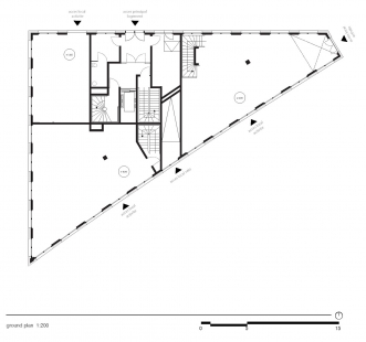
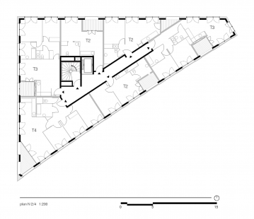
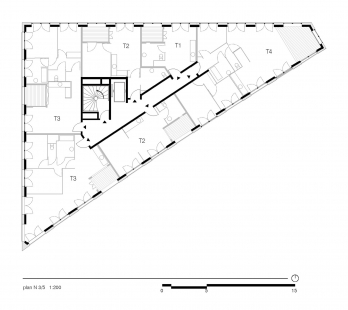
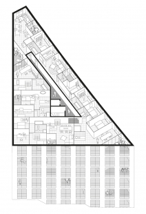
The volume is a perfect extrusion of the triangular parcel which fully exploits all the plot’s spatial possibilities. Through its flexibility, the project introduces the notion that by emptying an architecture of its program, a building generates potential that will accompany the evolutions in urban development and allow it to respond more readily to changes in use. The rue de Saussure building seeks to anticipate needs and changes by proposing a full reversibility between a residential and an office building.
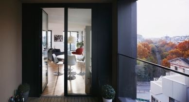
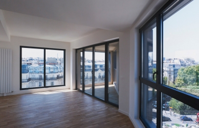
At the same time, this sense of openness gives each residence a very particular quality. The apartments have a lot of windows and are very well lit and spacious. They are all set up around a loggia, an extension of the interior living space towards the exterior. This type of patio also has a thermal function, introducing a new orientation in the building that helps ventilate the housing during the summer months.
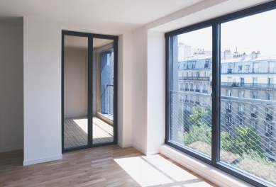
Above and beyond the classic, standard ratio, the mostly glass façades significantly enhance the quality of the building’s uses, which benefit from an abundance of natural light and views.
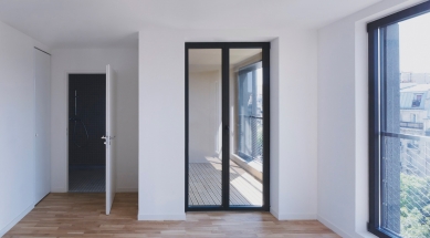
The size and regularity of the door and window openings, which are identical on the three façades, create a general image of the building without specifically denoting its use. A series of architectural distinctions on the façades compensates for the different levels of thermal comfort required on the northern and southern sides. The variations play out in the size of the openings – French doors which open fully to the south versus half-height windows to the north – in the position of the windows in relation to the façade, which use its thickness to create an interior projected shadow, in the position of the stores, inside and outside, as well as in the materiality of the railing, which is made of glass or stainless steel mesh.
The materials favor a certain sobriety and are limited in number: polished concrete tinted black for the prefabricated panels for the façade, black lacquered aluminum for the concealed opening frames, glass for the windows, both for the half-height windows and the railings, stainless steel mesh, etc.
"My conviction that space amounts to luxury hasn’t changed. It links up with one of my old desires, an inversion of sorts: build dwellings that resemble office plateau, because the best flats are the ones that offer the most free space; and reciprocally, build offices that resemble apartments, so that they offer warmth and a possible scale of identification. In Paris, the transformation of flats into offices and of offices into flats is an opportunity to come to grips with this sort of fertile offsets and ‘resistance’. Whenever you have something that is serving another purpose than the one it was designed for, there’s a chance of getting away from norms and repetitiveness. Which is one of the most promising paths of modernity is mutation."
LAN Architecture
0 comments
add comment


