Manggha - Museum of Japanese Art and Technology
Manggha - Muzeum Sztuki i Techniki Japońskiej

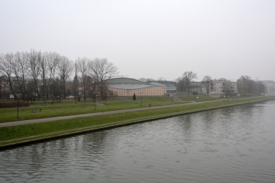
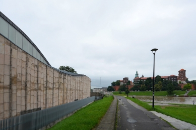
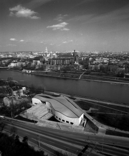
In November 1994 in Krakow, across the river from the Royal Castle on Wawel Hill, the Manggha Centre of Japanese Art and Technology was inaugurated. The building was designed by an eminent Japanese architect, Arata Isozaki, in collaboration with Krakow architects: Krzysztof Ingarden, Jacek Ewy and JET Atelier. It was designed as a place of encounter of two cultures - on a both historical and contemporary, artistic and technological plane.
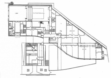
The function of the building is that of a museum and a venue of exhibitions, with a complex of multi-purpose spaces for conferences, concerts and theatre productions, also storage rooms, offices and historic preservation studios. The museum's exhibition spaces are filled with the Japanese art forming Feliks Jasieński's valuable collection, part of the Far East Art Collection owned by the National Museum in Krakow, and also temporary exhibitions of Japanese art and technology.
The History
The Manggha Centre project is the last link in a surprising chain of artistic inspirations, going back to the second half of 19th century, when Feliks Jasieński, an eccentric art lover, became fascinated with Japanese arts during his trips to France. The fascination resulted in a sizeable and valuable collection, composed mostly of woodblock prints, military accessories and netsuke. At the turn of the century, Jasieński brought it to Krakow. Japanese art, which he discovered and propagated, had freshness and power which enthralled Krakow's artists connected with the Academy, and the influence it exerted on their painting gained the name of Japonism as a movement within Polish Art Nouveau. In the 1920s, Jasieński's collection was donated to the National Museum, which is where it was stuck for years in storage rooms, only seldom exhibited. But for a narrow escape, the chain of inspirations that it carried could have been broken due to lack of adequate exhibition space.
In 1944, in Krakow under Nazi occupation, Germans exhibited a part of the collection in the Cloth Hall museum and that was when the nineteen-year-old Andrzej Wajda saw it. The vision of the world that it offered spoke to the young artist with unusual power, opening up new horizons before him. Years later, in 1987, when receiving his Kyoto Prize in Japan, granted to him in recognition of his lifetime achievement in film and theatre, the director reminisced about that exhibition: "I had never before seen so much brightness, light, order, and such a sense of harmony - that was my first encounter with real art. The feelings and raptures experienced when we are young are the strongest in our lives. This is why, receiving the Kyoto Prize, I look back on that moment and wish for others to be as happy as I was back then, gazing for the first time at the masterpieces of ancient Japanese art." Andrzej Wajda and his wife, Krystyna Zachwatowicz, decided to use the Kyoto Prize to form a Foundation whose object would be to construct a building in Krakow with exhibition space dedicated to Feliks Jasieński's collection and presentations of contemporary Japanese culture. The initiative was joined by Krakow city and voivodeship authorities, who provided the Foundation with a site in the central part of the city. The Japanese Government provided financial support, with some participation of the Polish Government. In Japan, tens of thousands of donors supported the initiative during a fund-raising campaign conducted by Etsuko Takano of the Iwanami Hall, and also the East Japan Railway Workers' Union. The latter raised around one million dollars for the Foundation. The Foundation received support - in the form of advice and much kindness - from the Japanese Embassy in Poland, headed by Ambassador Nagao Hyodo.
The Architectural Design
Towards the end of the 20th century, in a melting pot of architectural projects, it is hard to find and identify separately any local or national character of achievements in this area of activity. This is caused by the internationalisation of the art market, the standardisation of the clients' needs, the quantity and the rate at which architectural expressions come into being and vanish in the information abyss. Krakow, Poland's former capital, located somewhat aside from today's major whirlwinds and fashions of style, is a city where time still passes sufficiently slowly for art to be noticed, and also a city which - by reciprocity - art is able to notice as well. In its architectural layout, indigenous forms have over centuries intermingled with influences of various eras and cultures. And despite the fact that Witold Gombrowicz perceives this region of Europe as a country and a culture without a specific face (and let me quote his writing: "where the East and the West debilitate each other. Thus, a country of debilitated form... None of the great processes of European cultures has really ploughed through Poland, neither the Renaissance, nor religious wars, nor the French Revolution, nor the industrial revolution..."), still, places like this one, where the “forefields” of cultures meet and permeate one another, and peoples mingle and migrate, create an unexpectedly auspicious field for contestation, for unexpected encounters and surprising mutations of forms that have not been subjugated by rigorous orthodoxy. Centuries of historical layers have created in Krakow a coherent and pronounced urban complex of its Old Town, with the Castle dominating it from Wawel Hill - a national symbol. The site where the Manggha Centre has been built is located in a bend of the Vistula River, right across from Wawel Hill. It would be difficult to find a better context. Thus, the architect had a tough problem to solve: his task was to devise a form whose exterior would enter in a relationship with the architecture of Wawel while its interior was to become an adequate backdrop for exhibiting Japanese art. Neither could dominate. The solution was found in a form which was relatively neutral, void of direct iconic cultural connotations, and yet showed indirect and distant references to the traditions of both cultures: Japanese and Polish.
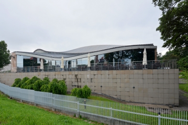
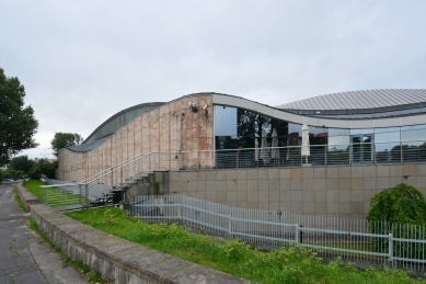
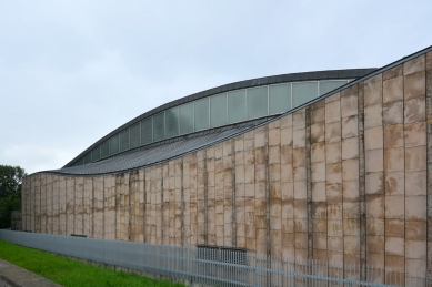
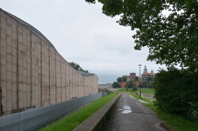
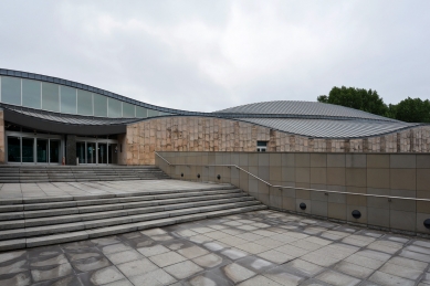
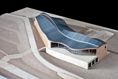
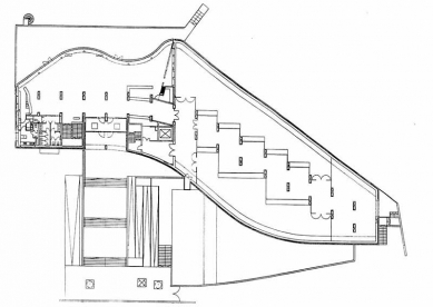
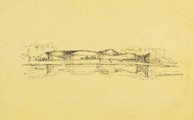
It needs to be pointed out, however, that for the intermingling of cultures and meanings that belong in different traditions to be successful, form itself had to become a pronounced sign - a skeleton carrying all other signs. Arata Isozaki decided that none of cultural references should be excessively exposed. He wanted the design to be able to cross cultural borders: "for this building - just as Jasieński's collection transcended the frames of Japanese art - to go beyond the frames of Japaneseness and take root in Polish soil." Therefore, the very place (topos) became one of the inspirations for the shape of the building. A structure visible from the terrace of Wawel Hill was inscribed into the meanders of the Vistula River flowing in the middle, to prevent interference with the genius loci that had been present here since time immemorial. A few wavy lines of the river which flows nearby dictated the geometry of the roof structure lines, as Isozaki wrote in a Manggha Centre catalogue. The broken curves of the waves also formed a distant Japanese reference - to a well-known engraving from the series entitled Thirty Six Views of Fuji by Hokusai, presented in Jasieński's collection, depicting fishermen on a boat carried by a big, dominating wave. It was this motif of a WAVE that became the core, the fabric and the main form of the design, with a double reference: to Japanese motifs at the level of an iconic sign, and to the local topographic context at the level of a sign described as an "index" (the river embankment co-defines the shape of the building) and also as a “mimesis” of the river meandering at the foot of Wawel..
Two Cultural Traditions: the Entrance Path - Maze and Perspective
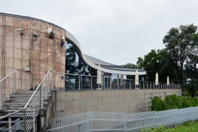
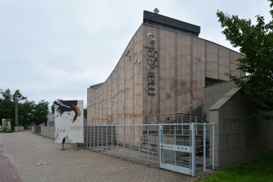
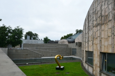
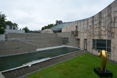
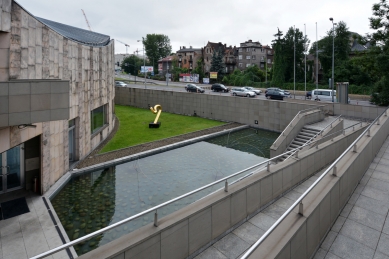
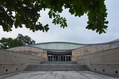
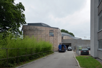
In the functional layout of the building, a clear scenario can be perceived, leading viewers at the entrance inside and submitting them to the action of successive changing stage sets which form a path, or a scenario, of the entrance. The path has its beginning, elaboration and culmination, like a classic Greek tragedy. The main entrance to the building is located at ul. Konopnicka. This is a busy, noisy thoroughfare carrying transit traffic through the centre of Krakow - not a neighbourhood desired for a museum. The noise posed a serious threat to the contemplative ambiance of exhibition rooms. The facility had to be designed so as to become an acoustic screen itself. Therefore, two belts of walls were positioned along the street as a surrogate fortress defending the interior from the din of the city. The first wall, 150-120cm tall, directs a visitor to the entrance, and the other one - the wavy wall of the building, heavy, almost void of windows - distances itself from the street where wide stairs ascend towards the gate cut through in the brick wall. Between these walls, in a moat of sorts, which ensures relative tranquillity, a pool of water and a small garden have been designed. The entrance path leads a visitor through the two lines of walls across the moat. The way it is shaped shows affinity to the principles of composition characterising the architecture of Japanese samurai residences, palaces or fortresses. The path leading to the main entrance is not visible in its entirety at first, nor is it marked out in a manner which can be predicted in advance by a visitor.
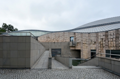
There is no monumentality in it, no axiality, no symmetry. It is divided into short, broken sections which, when traversed, open up before the eyes of an onlooker new images, new perspectives, and new surprising elements at its converging point. Thus, the first section of the path - the pavement along the street in front of the wall encapsulating the 'moat' garden - is the beginning of the scenario: it invites you to walk along the wall, further on, without yet showing the goal which is the entrance door of the building. What can be seen from behind the outer wall is a ribbon of the stone entrance elevation, or actually only its upper part without windows, while the outer wall itself, along a gentle arced line, directs the traffic along the building and leads one's sight toward the tree growing in the inner courtyard, on one side of the axis of the main entrance. A person walking along the wall will notice after a while that the level of the pavement ascends gently and that it enables him or her to notice, on the right hand side, a pool in a lowered garden, emerging behind the wall. An unexpected view is unveiled; one can stop for a moment, embrace the hidden garden with one's sight, and those who head for the offices will see the descending path, down the stairs, next to the pool. Others will go on toward the tree which closes off the perspective of the access path and only after they have come near it will a new perspective open up before them on the right (hidden until now us well), to show wide stairs leading to the main entrance. Here, they will need to turn right by 90 degrees and walk towards a dark opening which forms the gateway to the interior.
Composition of the Solid; Asymmetry and Order
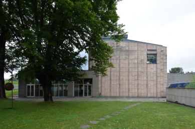
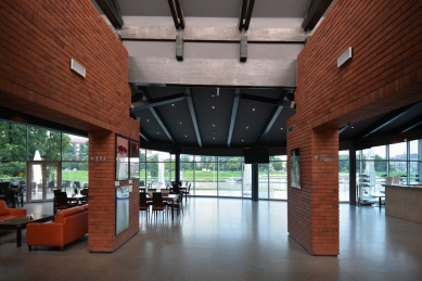
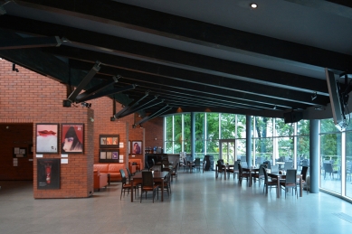
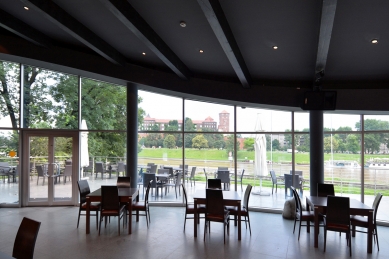
The entrance to the building is cut in the stone wall, as wide as the stairs, and upwards all the way to the roofline. Placed in the centre of the opening is a post which supports the roof descending here in a basketlike manner. Such a composition of the entrance gate, with a post and a basket roof on the symmetry axis of the entrance, shocks architects who look at it from the point of view of Western, classical rules of architectural composition. It is a result of a different compositional logic, based on asymmetry. Bruno Taut, a German Modernist architect and Japanese architecture lover, perceived asymmetry as its typical and essential feature. The logic of this asymmetric composition can be noticed when you analyse the whole solid of the building - in particular its undulating roof. It is made up of planes covering the three structural tracts along the building. These planes (parabolic hyperboloids), or ribbons, are made up of sinusoids, and each of them has a different amplitude and length. This variability of rhythm endows the solid with a very natural, organic character, making it similar to a free layout of sea waves frozen in a still picture. The waves of the roof look as if the tops of some waves missed the bottoms of others, irregularly, yet it can be noticed that this free composition has one element which brings about some order: all the planes of the waves are caught and clipped together at one point - along the entrance axis. Emphasised with a post on the front side, it imposes order instantly on all the trembling geometry of waves and clips together all the sinusoids in their maxima or minima. This way, it determines a special point in the building, the point where you can get under the waves of the roof and proceed underneath them in the direction set by that axis, with an orderly sequence of waves above your head. The axis which imposes order on the entrance and on the layout of waves leads the viewer further on inside - to the other side of the interior, which is in a full and deliberate contrast to the heavy stone entrance elevation. It is entirely open and glazed, showing a panoramic view of the Vistula and its opposite bank with Wawel one the left and St. Stanislaus’ Church on the right. The large panoramic window of the entrance hall and of the café frames the view of the opposite bank. The view thus becomes a borrowed element of the composition (shakkei). It is the culmination and a reward for the viewer who has traversed the path - the scenario. At the same time it unveils for the newcomer the historical context in which the collection of Japanese art has been situated. It allows you to stop for a moment – the time needed to pass from the noisy world of the street to the world of perception of art and reflection.
The Interior
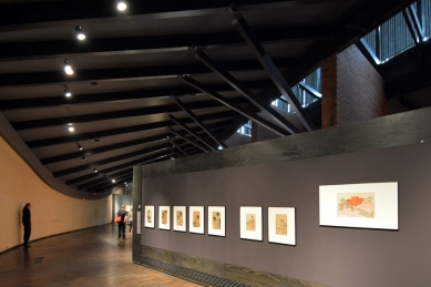
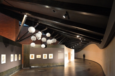
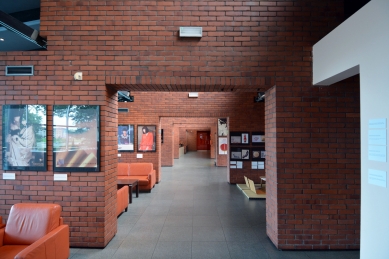
The finish of the interiors is a consistent complementation of the scenario. We have mentioned that the interiors are intended to stress the bi-cultural dimension of the facility. One can notice already in the entrance hall that the central route within the building, composed of a series of large gates, is dualist in nature: utterly un-Japanese due to the finish material, and Japanese in terms of composition. The gates, which align themselves like ever smaller stage wings in a perspective, one behind another, and move on from the hall to the exhibition hall, resemble the rhythm of tori gates on a path forming the entrance to some Japanese temples. These gates, however, in the building, are clad with brick, a material utterly alien to Japanese tradition. Can such a material be a backdrop for display of Japanese art? Using it here is intended as a way to transfer the external context of the site into the exhibition room. For the viewer, it is to provide information that Jasieński's collection is exhibited near Wawel walls - walls made of brick and visible from the entrance hall. It is also to signal that the Manggha Centre building is part of the culture of a specific place near Wawel. At the same time, the other elements of the interior - dark-wood structures (deep bog green), dark-grey ceiling between the beams, and the black hardwood of the floor - are to create a mysterious space of darkness, an ambiance comparable to murky interiors of Japanese castles of the Edo period. The interior of the exhibition room had to be strong and stark enough for the displayed samurai armours to feel at home, and sufficiently delicate and neutral to prevent them from dominating the sensitive Japanese woodblock prints. When describing the composition of the Japanese Centre, one should point out that, in structural terms, the building is subordinated to form. In other words, its form is not the result of simple structural or functional necessity (which was the primary postulate of Modernism in architecture).
In the case of the Centre, the form is decided by the content that it is to represent, although clearly the form has to allow for adequate realisation of the function. The building of unique form, austere and void of excessive detail after the Modernist manner, is to tell a poetic tale of two cultures. Such a special correlation between the architect's intention - a poetic tale - and the form which is to express it can be described by paraphrasing the well-known Modernist slogan "form follows function" into one that describes the Manggha Centre better: form follows poetry.
Krzysztof Ingarden
0 comments
add comment


