New Stedelijk Muzeum
The new Stedelijk Museum

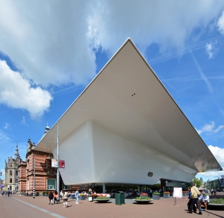
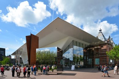
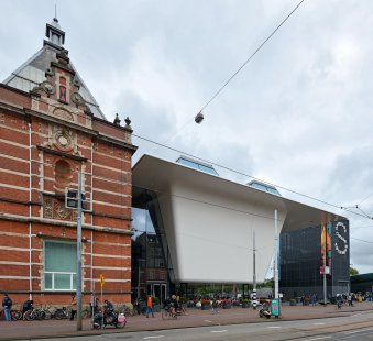
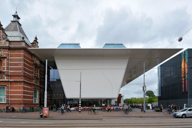
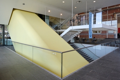
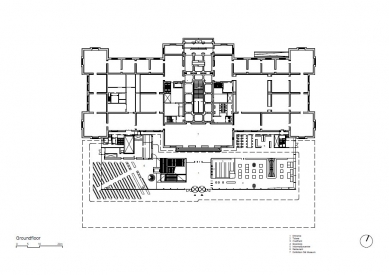
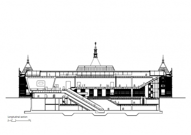
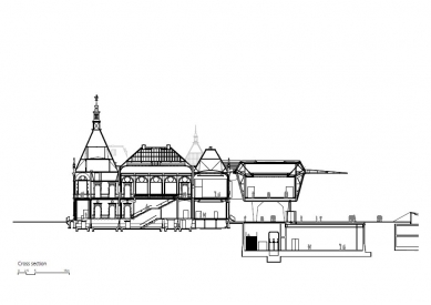
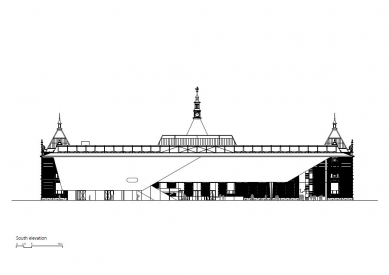
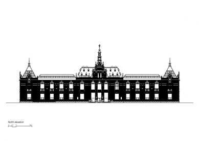
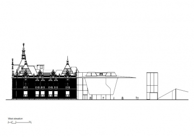
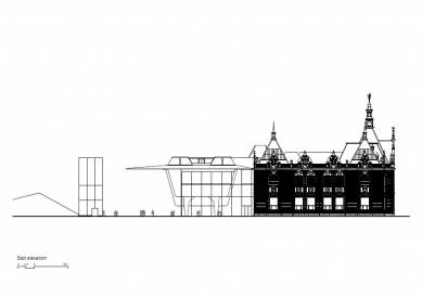
Amsterdam's Stedelijk Museum is being renovated and enlarged. Designed by A.W. Weissman, the building is celebrated for its majestic staircase, grand rooms and natural lighting. These strong points have been retained in the design along with the colour white introduced throughout the museum by former director Willem Sandberg. The existing building is left almost entirely intact and in full view by lifting part of the new volume into space and sinking the rest underground.
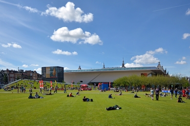
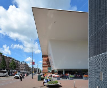
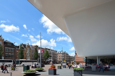
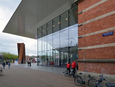
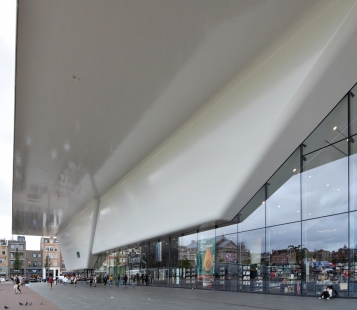
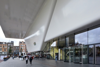
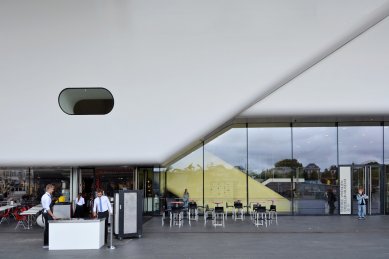
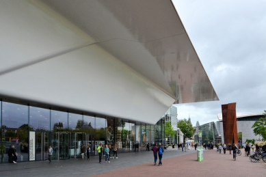
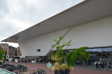
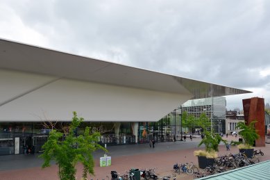
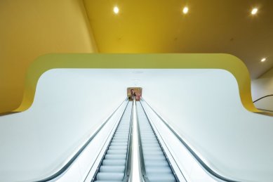
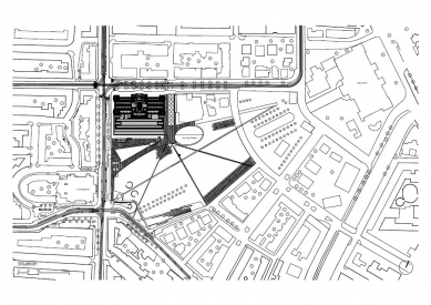
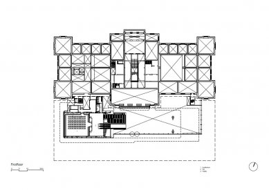
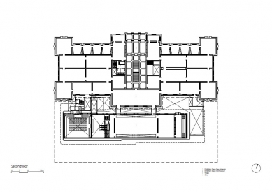
Its entrance has been moved to the open expanse of Museumplein where it occupies a spacious transparent extension. The volume above the entrance with its roof jutting far into space has a seamless sandwich construction of reinforced fibre. With this change in orientation and the jutting roof, the museum comes to lie alongside a roofed plaza that belongs as much to the building as to Museumplein.
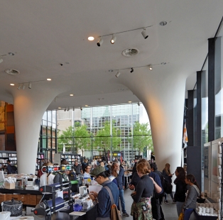
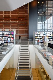
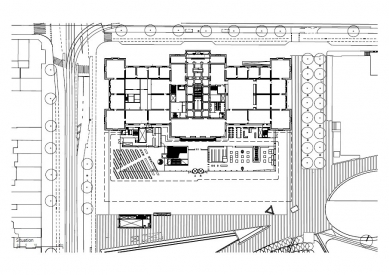
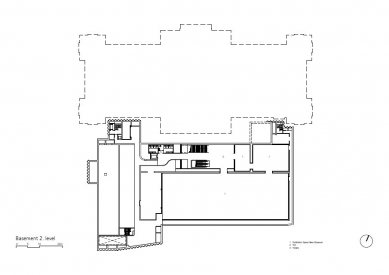
An information centre, the library, a museum shop and a restaurant with terrace on Museumplein are to occupy the transparent addition. Below the square, the main feature will be a large exhibition hall of some 1100 m². The exhibition room in the hovering volume is directly connected to the main exhibition hall of the original building.
The Weissman building is to be sensitively reinstated in its former glory as it embarks on a new life facing Museumplein under one roof with the new addition.
0 comments
add comment


