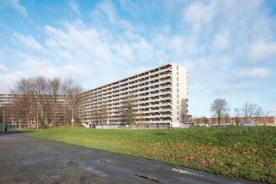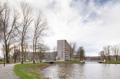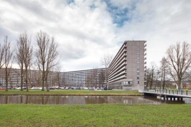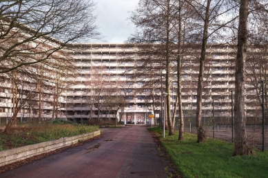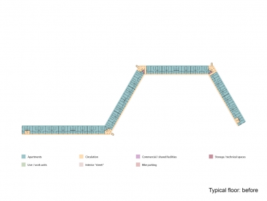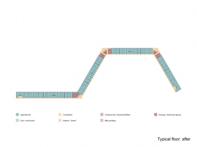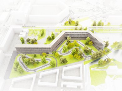
DeFlat apartment building
DeFlat Kleiburg

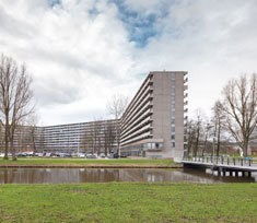 |
| foto: © Stijn Poelstra |
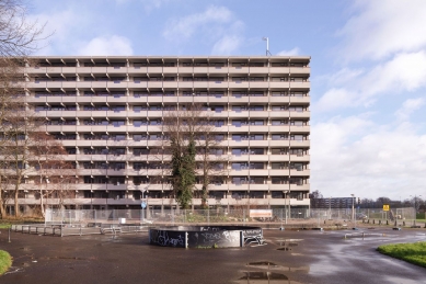
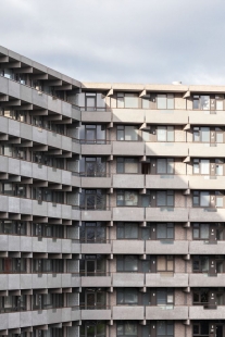
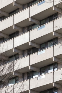
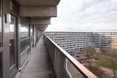
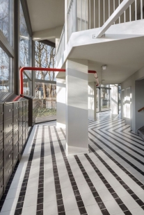
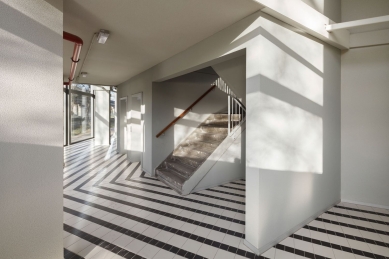
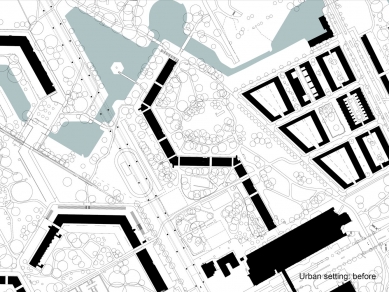
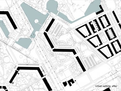
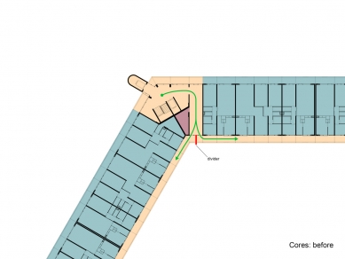
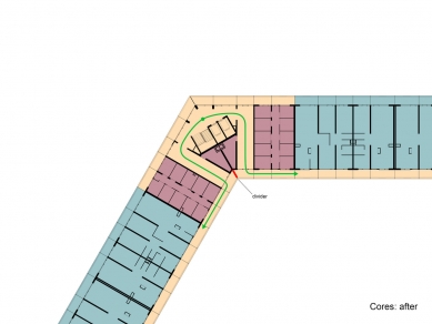
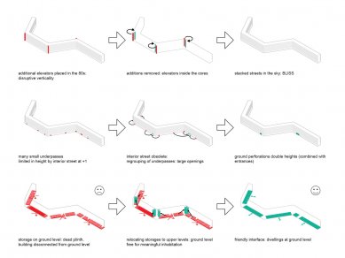
Most attempts to renovate residential slabs in the Bijlmer had focused on differentiation. The objective: to get rid of the uniformity, to ‘humanize’ the architecture. By many, repetition was perceived as evil. But after three decades of individualization, fragmentation, atomization it seems an attractive idea to actually strengthen unity: Revamp the Whole! It is time to embrace what is already there, to reveal and emphasize the intrinsic beauty, to Sublimize! In the eighties three shafts had been added including extra elevators: they looked ‘original’ but they introduced disruptive verticality. It turned out that these concrete additions could be removed: the elevators could actually be placed inside the cores, the brutal beauty of the horizontal balusters could be restored. On the galleries the division between inside and outside was rather defensive: closed, not very welcoming. The closed parts of the facade were replaced with double glass. By opening-up the facade the ‘interface’ becomes a personal carrier of the identity of the inhabitants, even with curtains closed…
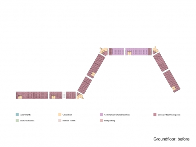
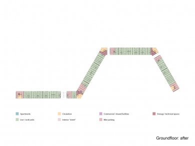
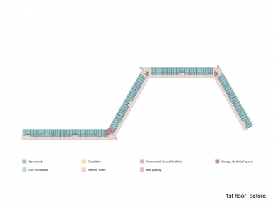
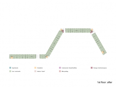
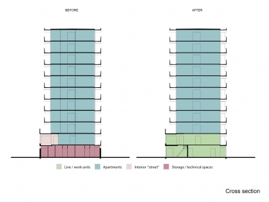
Sandblasting the painted balusters revealed the sensational softness of the pre-cast concrete: better than travertine! Originally the storage spaces for all the units were located on ground level. The impenetrable storerooms created a ‘dead zone’ at the foot of the building. By positioning the storage on each floor we could free up the ground floor for inhabitation, activating it to create a social base and embedding the ‘beast’ in the park. More generous, double height connections between both sides of the building were formed creating scenic relationships. Gallery illumination has a tendency to be very dominant in the perception of apartment buildings with single loaded access. The intensity of the lamps that light up the front doors on the open-air corridors overrules the glow of the individual units. The warm ‘bernstein’ radiance of the apartments is ‘obscured’ by a screen of cold lights. But what if the gallery lights worked with energy saving motion detectors? The individual units now define the appearance. Every passer-by a shooting star!
0 comments
add comment


