
University Library Utrecht

 |
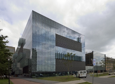
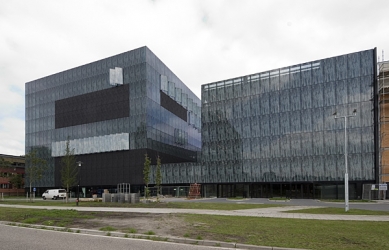
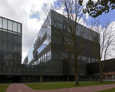
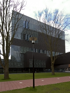
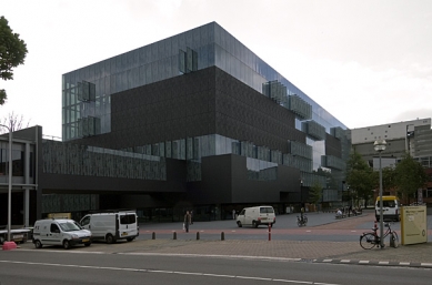
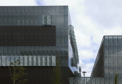
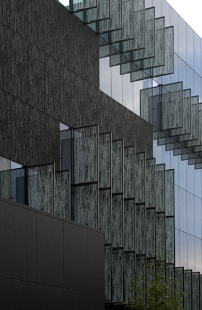
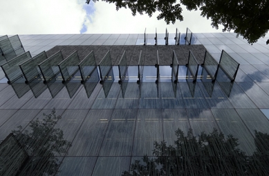
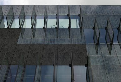
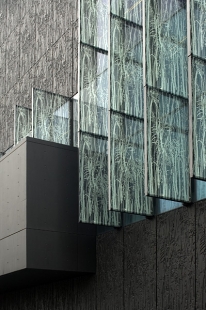
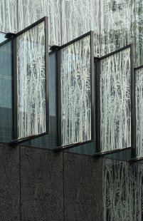
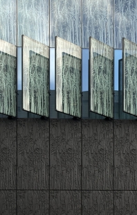
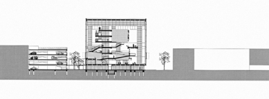
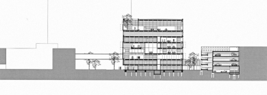
In the Netherlands, unlike Switzerland, orthodox minimalists have never fared well, and therefore the ornament on the façade of Aret's library is less surprising than in a similar institution in Eberswalde by the duo of Herzog & de Meuron. The outer shell is made up of sheets of etched glass and shaped concrete panels (using rubber strips inserted into molds) featuring a reeds motif by photographer Kim Zwarts. The result is not like the Eberswalde university library, where the differences between glass and concrete are blurred; however, in this case, despite the completely different construction materials coming closer in color and texture, the outcome gives the impression that the architect wanted the building to appear dirty and outdated even before its completion. Aretse: “We thought that in its semi-rural location, the library should feel natural.”
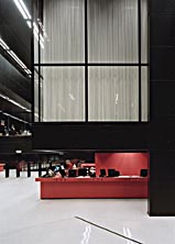
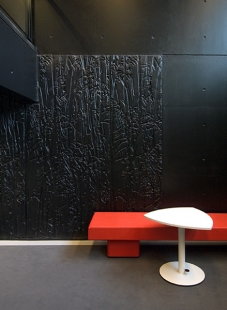
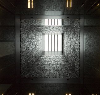
Another opportunity for comparison arises with the Seattle Central Library. Koolhaas's program was meant to attract a new type of reader. His building is primarily for people who should not be bored under any circumstances. In the case of the university library, the task is different - to avoid distraction. Almost all vertical elements are black. The only colorful (distracting) accents are the red information center and the lending counters. The print on the glass reduces light permeability and evokes feelings of mystery to the point of oppression. Aretse: “I wanted to create a place for contemplation, a place of calm and brightness in our confusing modern world. Together with the lighter-colored floor and work desks, the black color creates the perfect atmosphere for studying.”
However, Aaron Betsky believes that in a library without a clear orientation system, full of staircases and dark corners, love for learning may thrive. Time will tell.
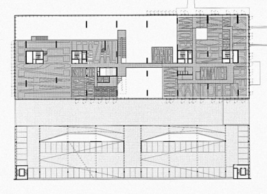
Data: 4.2 million volumes, 300 computers, 1000 study spots, 1 bar, 1 auditorium, 6 lecture rooms, 450 parking spaces.
The English translation is powered by AI tool. Switch to Czech to view the original text source.


6 comments
add comment
Subject
Author
Date
...
...
04.03.10 01:17
...
...
04.03.10 01:37
černá kostka z Ostravy
Karel
04.03.10 02:01
...
...
04.03.10 06:03
pro zamyšlení
...
04.03.10 06:09
show all comments