

Vinohradský penthouse

Rental buildings have a memory. And this one remembers a lot. Similarly, our relationship with the Fidurock group, led by David Hauerland, began with a proposal for a showroom featuring high-end audiovisual technology VOIX, continued with two office projects, and naturally culminated in the most immediate project – the design of one of their unique premium apartments.
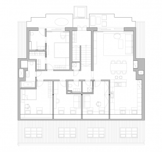
Fidurock approached me at the moment when we were successfully completing the realization of their new offices. They knew exactly what they wanted – and at the same time, they gave me the space to propose a solution that would correspond to both the character of the building and the way in which the future tenant, who wishes to indulge in quiet luxury, would live in it. When a developer reconstructs an entire historical building and creates an apartment in its attic, it's not just another development project. The apartment was born as a personal imprint in a space with history – under the slopes, with a view of the Vinohrady courtyard and with ceilings that we did not lower. On the contrary.
Living Area: Height, Air, Sparseness
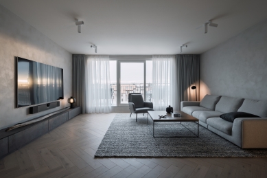
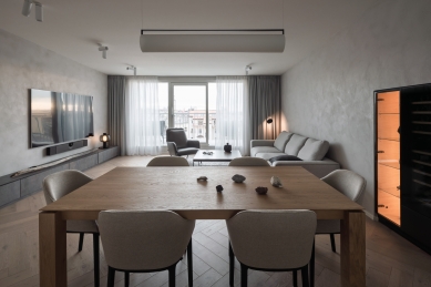
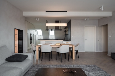
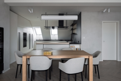
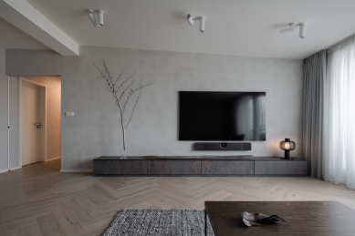
The assignment was clear: do not lower the ceilings, but rather lift them as high as possible. Even at the cost of exposed supporting beams. Thus, a space was created that is defined by height and view, not furniture. The living room is airy, natural, and uncluttered. Just what has its place: a low cabinet under the TV, a comfortable sofa, a built-in wine rack, and a glass showcase. Both built-ins were created in places offered by the structure of the apartment building – intricate, seemingly irregular niches transformed into practical details.
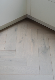
The floor refers to the historical memory of the house – a herringbone parquet pattern that honors the classic but is executed in a contemporary shade. Bleached oak with a subtle gray undertone feels sophisticated, neutral, yet warm. The walls feature a decorative plaster in warm shades of gray. At first glance unobtrusive, but compared to classic white paint, it feels soft, cozy, with a calm depth – and matches the character of this apartment much more naturally than standard white.
Light and Space
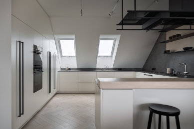
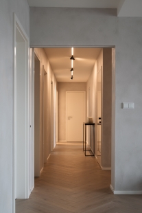
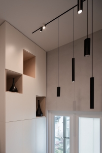
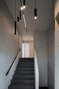
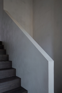
The lighting is designed to be as unobtrusive as possible – but functionally precise. In places where we could work with ceilings, we integrated lighting into them. In the kitchen, hallway, and above the staircase, we used track systems in the ceilings that allow for great variability – both in placement and selection of specific fixtures, and finally in their direction.
Where the technical possibilities of the ceilings fell short, we opted for a discreet yet subtle solution, allowing the light to remain part of the space, not its motif.
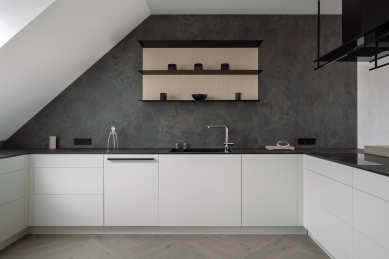
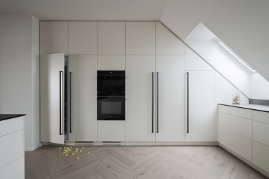
Kitchen: Modest in Gestures, Generous in Space
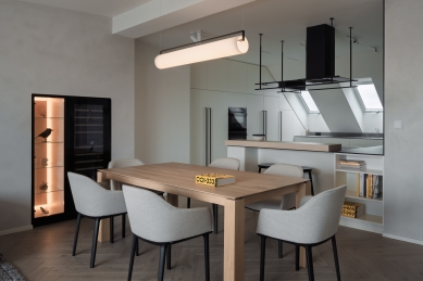
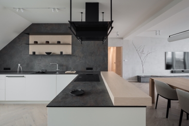
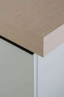
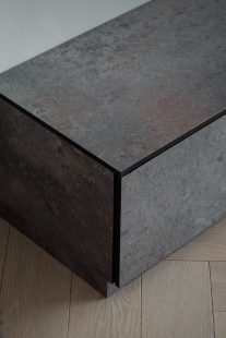
The kitchen appears unassuming, yet it has a clear handwriting. It is generous in space, settled in simple white lacquered cabinets without unnecessary effects but with a striking compact countertop, which serves as both a work surface and a backsplash behind the sink. The same material thoughtfully returns on the TV cabinet in the living area, providing visual continuity throughout the space. Thus, the kitchen is not an island but a natural part of the open living space – functional, clean, and well anchored.
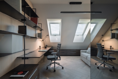
Office: Calm in Dark Tones
In the office, we slightly deviate from the rest of the apartment – at the client's request, dark wood dominates here, appearing both on the desk and on the atypical bookshelf. The latter is supported by a subtle steel structure that feels light but firm. An interesting element is the toned mirror on the wall, which visually expands the space while also adding a bit of mystery and depth.
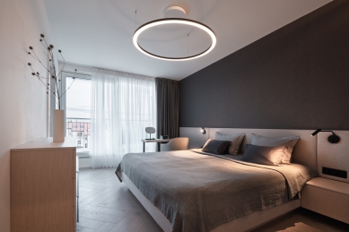
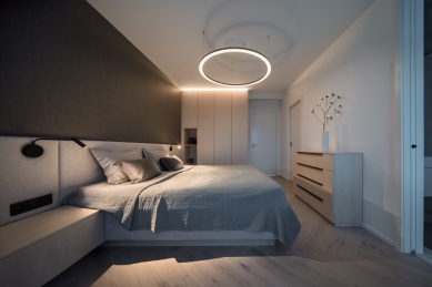
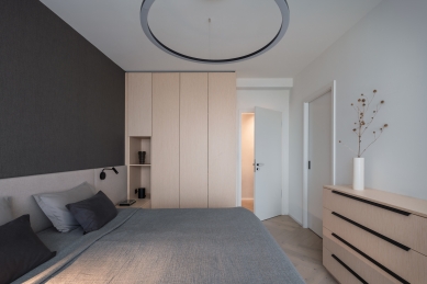
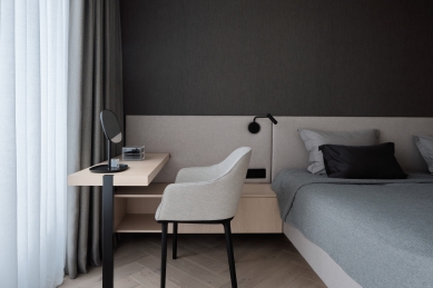
Bedroom: Subtle Layers
The bedroom adopts the gentle palette of the entire apartment – the key material here is bleached oak, which alternates in various forms throughout the interior. The space is tuned into calm, natural tones that allow the upholstered bed to stand out, above which is wallpaper that matches the tone of both the bed and the textiles in the space. A subtle vanity table follows the bed, placed directly in front of the window – an ideal spot for morning preparations where the soft daylight shines through.
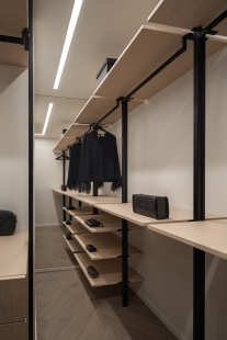
Walk-in Closet: Variability in a Small Space
Behind the bedroom opens a compact yet thoughtful walk-in closet. The base consists of a metal system that allows for variable arrangements of shelves, drawers, and hanging rods – according to needs and the rhythm of everyday operation. The shelves and drawers echo the shade of bleached oak. Two opposite walls are covered with large-format mirrors, which visually enlarge the space, multiply the light, and add airiness.
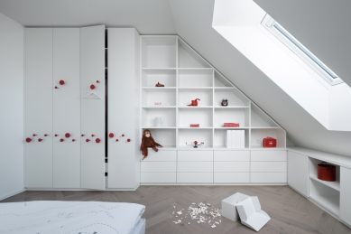
Children's Room: Simplicity with Ideas
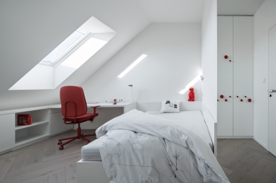
The children's room remains true to basic white but works with it in clever details. The handles of the wardrobes are designed in a red color that gives the space a striking visual accent. Due to their shape and placement, they also function practically – serving as hooks for clothes or school bags. Everything is designed in a custom manner, but with an emphasis on making the room adaptable according to the age and needs of the children.
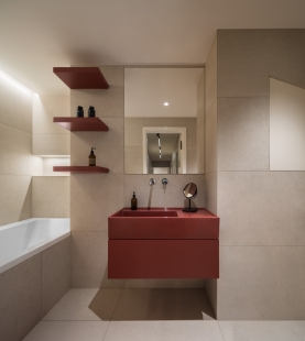
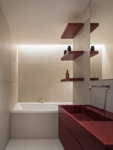
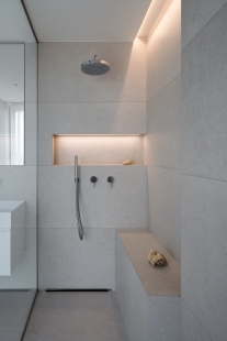
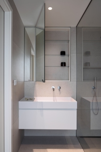
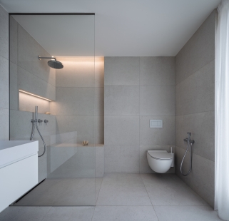
Bathroom with a View
The original proposal included a master bathroom between the bedroom and the closet – without daylight, without a view. It was a functional position, but felt too closed. We decided to change that. The bathroom deserves light – and here it has received it fully. Even with access to the terrace.
#bathroomwithaview is not a phrase – from the shower, there is a view into the deep Vinohrady courtyard.
Thanks to the intricate perimeter wall, we could partially recess the shower area – creating a comfortable seating space, ideal for times when you want to pause in the shower, sit down, and simply look outside. And still be entirely private.
The children's bathroom follows the same material spirit as the main one – the same tiling, the same flooring – but lightened by red sanitary fixtures that provide energy and are easily changeable as the children grow older.
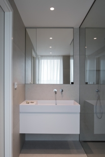
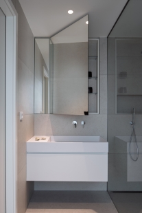
Both bathrooms were developed with an emphasis on efficient use of space – each niche has its purpose, each detail corresponds to the layout. This also applies to the toilet – a simple tiling with a three-dimensional decorative strip is delicate, yet livens up the overall expression of the space.
The apartment was created as a natural continuation of the house and the relationship with the client. It was not about a contrast to the historical building but about its complement – respecting proportions, materials, and everyday operation.
Many solutions arise from the very structure of the house – from the complexity of the walls, the height of the ceilings, or the direction of light. Nothing here is superfluous, but everything has its reason. The resulting space may be unobtrusive. But it exactly corresponds to who lives in it – and to where it was created.
Fidurock approached me at the moment when we were successfully completing the realization of their new offices. They knew exactly what they wanted – and at the same time, they gave me the space to propose a solution that would correspond to both the character of the building and the way in which the future tenant, who wishes to indulge in quiet luxury, would live in it. When a developer reconstructs an entire historical building and creates an apartment in its attic, it's not just another development project. The apartment was born as a personal imprint in a space with history – under the slopes, with a view of the Vinohrady courtyard and with ceilings that we did not lower. On the contrary.
Living Area: Height, Air, Sparseness
The assignment was clear: do not lower the ceilings, but rather lift them as high as possible. Even at the cost of exposed supporting beams. Thus, a space was created that is defined by height and view, not furniture. The living room is airy, natural, and uncluttered. Just what has its place: a low cabinet under the TV, a comfortable sofa, a built-in wine rack, and a glass showcase. Both built-ins were created in places offered by the structure of the apartment building – intricate, seemingly irregular niches transformed into practical details.
The floor refers to the historical memory of the house – a herringbone parquet pattern that honors the classic but is executed in a contemporary shade. Bleached oak with a subtle gray undertone feels sophisticated, neutral, yet warm. The walls feature a decorative plaster in warm shades of gray. At first glance unobtrusive, but compared to classic white paint, it feels soft, cozy, with a calm depth – and matches the character of this apartment much more naturally than standard white.
Light and Space
The lighting is designed to be as unobtrusive as possible – but functionally precise. In places where we could work with ceilings, we integrated lighting into them. In the kitchen, hallway, and above the staircase, we used track systems in the ceilings that allow for great variability – both in placement and selection of specific fixtures, and finally in their direction.
Where the technical possibilities of the ceilings fell short, we opted for a discreet yet subtle solution, allowing the light to remain part of the space, not its motif.
Kitchen: Modest in Gestures, Generous in Space
The kitchen appears unassuming, yet it has a clear handwriting. It is generous in space, settled in simple white lacquered cabinets without unnecessary effects but with a striking compact countertop, which serves as both a work surface and a backsplash behind the sink. The same material thoughtfully returns on the TV cabinet in the living area, providing visual continuity throughout the space. Thus, the kitchen is not an island but a natural part of the open living space – functional, clean, and well anchored.
Office: Calm in Dark Tones
In the office, we slightly deviate from the rest of the apartment – at the client's request, dark wood dominates here, appearing both on the desk and on the atypical bookshelf. The latter is supported by a subtle steel structure that feels light but firm. An interesting element is the toned mirror on the wall, which visually expands the space while also adding a bit of mystery and depth.
Bedroom: Subtle Layers
The bedroom adopts the gentle palette of the entire apartment – the key material here is bleached oak, which alternates in various forms throughout the interior. The space is tuned into calm, natural tones that allow the upholstered bed to stand out, above which is wallpaper that matches the tone of both the bed and the textiles in the space. A subtle vanity table follows the bed, placed directly in front of the window – an ideal spot for morning preparations where the soft daylight shines through.
Walk-in Closet: Variability in a Small Space
Behind the bedroom opens a compact yet thoughtful walk-in closet. The base consists of a metal system that allows for variable arrangements of shelves, drawers, and hanging rods – according to needs and the rhythm of everyday operation. The shelves and drawers echo the shade of bleached oak. Two opposite walls are covered with large-format mirrors, which visually enlarge the space, multiply the light, and add airiness.
Children's Room: Simplicity with Ideas
The children's room remains true to basic white but works with it in clever details. The handles of the wardrobes are designed in a red color that gives the space a striking visual accent. Due to their shape and placement, they also function practically – serving as hooks for clothes or school bags. Everything is designed in a custom manner, but with an emphasis on making the room adaptable according to the age and needs of the children.
Bathroom with a View
The original proposal included a master bathroom between the bedroom and the closet – without daylight, without a view. It was a functional position, but felt too closed. We decided to change that. The bathroom deserves light – and here it has received it fully. Even with access to the terrace.
#bathroomwithaview is not a phrase – from the shower, there is a view into the deep Vinohrady courtyard.
Thanks to the intricate perimeter wall, we could partially recess the shower area – creating a comfortable seating space, ideal for times when you want to pause in the shower, sit down, and simply look outside. And still be entirely private.
The children's bathroom follows the same material spirit as the main one – the same tiling, the same flooring – but lightened by red sanitary fixtures that provide energy and are easily changeable as the children grow older.
Both bathrooms were developed with an emphasis on efficient use of space – each niche has its purpose, each detail corresponds to the layout. This also applies to the toilet – a simple tiling with a three-dimensional decorative strip is delicate, yet livens up the overall expression of the space.
The apartment was created as a natural continuation of the house and the relationship with the client. It was not about a contrast to the historical building but about its complement – respecting proportions, materials, and everyday operation.
Many solutions arise from the very structure of the house – from the complexity of the walls, the height of the ceilings, or the direction of light. Nothing here is superfluous, but everything has its reason. The resulting space may be unobtrusive. But it exactly corresponds to who lives in it – and to where it was created.
The English translation is powered by AI tool. Switch to Czech to view the original text source.


0 comments
add comment