
Reconstruction of Apartment Hodonín

The clients' original concept differed significantly from the final solution. They were basing their ideas on the historical layout of the apartment building from the 1950s, which featured a wide central hallway intended to be a multifunctional space, a combination of a playroom, a relaxation area, and a social zone that would serve as the heart of the home. However, this central space lacked natural light, and even by opening it up to the surrounding rooms, it would not gain sufficient illumination. Thus, we ultimately took a completely different approach.
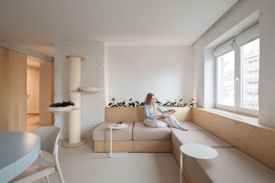
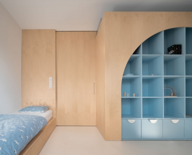
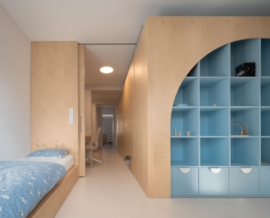
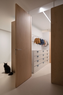
We demolished almost all the original partitions and built a bathroom and a children's wardrobe in the center of the layout. Around the core, the individual daytime zones branch out: the main living area with the kitchen, a study, and children's rooms. The space can function together as one large open area, or it can be separated into smaller rooms according to mood with sliding doors. This way, the apartment can transform over time according to the family’s current needs.
The only completely separate room in the apartment is the bedroom—a compact sleeping box with an unusually large bed measuring 2.8 × 2.1 meters. Comfortably, not only both parents but also their small children can sleep on it—all together, in one soft nest created exactly according to the rhythm and needs of their everyday life.
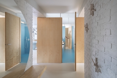
The theme of the load-bearing structures is the revelation of their materiality. We had the load-bearing walls cleaned down to the brick structure, which we reveal without plaster, only applying a white coating. Thus, we also intended to uncover the original concrete beams down to the structural concrete, but due to inadequately covered and fire safety non-compliant exposed steel reinforcements, we were forced to modify the beams and apply a new, light gray cement screed.
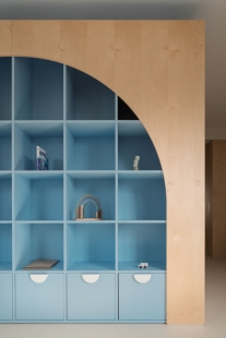
We treated the new partitions more as built-in furniture than traditional building elements—light, functional, with a cladding of light birch veneer that brings a warm and inviting tone to the interior. We chose this solution intentionally: veneer is a more durable and practical choice for the most stressed surfaces around the central core, where classic plaster would quickly lose its quality. We did not forget the smallest inhabitants either—a discreet cat door was integrated into one of the wardrobe doors, blending practicality with playfulness. We brightened the core itself with glass skylights at the level of the concrete lintels, which allow natural light to enter the center of the layout. They are complemented by an opening window between the bathroom and the kitchen, which not only visually links the space but also allows for effective and natural ventilation.
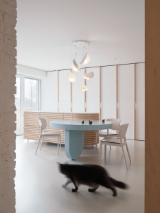
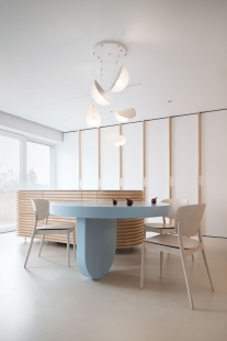
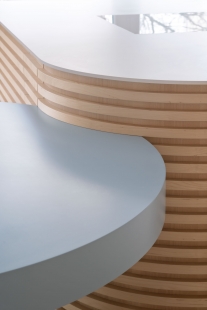
The theme of custom furniture focuses on curves that support the natural flow of the open space. Locally used solid wood slats contribute not only to acoustic comfort but also to an overall atmosphere of calm and naturalness.
The interior feels light and clean, greatly enhanced by a cast polyurethane screed in a soft cream shade—solid, seamless, visually unifying the floor and allowing the other materials to stand out.
A subtle but striking color accent is brought by blue, inspired by the traditional colors of Slovácko folk architecture, where it appears on the foundations of houses. In this project, it is reinterpreted in a contemporary spirit—it appears in the details of the wooden furniture and in the central core even as a full-surface wall treatment in the form of a blue screed, which adds a distinctive character and depth to the space.
We demolished almost all the original partitions and built a bathroom and a children's wardrobe in the center of the layout. Around the core, the individual daytime zones branch out: the main living area with the kitchen, a study, and children's rooms. The space can function together as one large open area, or it can be separated into smaller rooms according to mood with sliding doors. This way, the apartment can transform over time according to the family’s current needs.
The only completely separate room in the apartment is the bedroom—a compact sleeping box with an unusually large bed measuring 2.8 × 2.1 meters. Comfortably, not only both parents but also their small children can sleep on it—all together, in one soft nest created exactly according to the rhythm and needs of their everyday life.
The theme of the load-bearing structures is the revelation of their materiality. We had the load-bearing walls cleaned down to the brick structure, which we reveal without plaster, only applying a white coating. Thus, we also intended to uncover the original concrete beams down to the structural concrete, but due to inadequately covered and fire safety non-compliant exposed steel reinforcements, we were forced to modify the beams and apply a new, light gray cement screed.
We treated the new partitions more as built-in furniture than traditional building elements—light, functional, with a cladding of light birch veneer that brings a warm and inviting tone to the interior. We chose this solution intentionally: veneer is a more durable and practical choice for the most stressed surfaces around the central core, where classic plaster would quickly lose its quality. We did not forget the smallest inhabitants either—a discreet cat door was integrated into one of the wardrobe doors, blending practicality with playfulness. We brightened the core itself with glass skylights at the level of the concrete lintels, which allow natural light to enter the center of the layout. They are complemented by an opening window between the bathroom and the kitchen, which not only visually links the space but also allows for effective and natural ventilation.
The theme of custom furniture focuses on curves that support the natural flow of the open space. Locally used solid wood slats contribute not only to acoustic comfort but also to an overall atmosphere of calm and naturalness.
The interior feels light and clean, greatly enhanced by a cast polyurethane screed in a soft cream shade—solid, seamless, visually unifying the floor and allowing the other materials to stand out.
A subtle but striking color accent is brought by blue, inspired by the traditional colors of Slovácko folk architecture, where it appears on the foundations of houses. In this project, it is reinterpreted in a contemporary spirit—it appears in the details of the wooden furniture and in the central core even as a full-surface wall treatment in the form of a blue screed, which adds a distinctive character and depth to the space.
The English translation is powered by AI tool. Switch to Czech to view the original text source.


0 comments
add comment