

Showroom with filming equipment

Condition Before Reconstruction
The building was originally designed as an artist's studio situated in a private garden. Over time, with the development and change of ownership, it evolved into a two-story multifunctional building primarily used for residential purposes. The residential units occupied the entire first floor. The ground floor housed garages and a smaller commercial unit. Both commercial and residential units had the same ceiling height of 2.6m, which was unsuitable for commercial use. The layout of the building is divided into two rectangular wings, separated by a staircase. The eastern wing is a double tract divided by a robust system of reinforced concrete columns with beams.
Access to the building is from the adjacent street via a gate. The entrances to the building are oriented towards the courtyard, without direct contact with the street space.
Assignment
The size of the commercial unit gradually became restrictive for operations. At the time when the client approached us, the shop was more of a warehouse than a suitable area for showcasing attractive products. The residential units upstairs were no longer inhabited and served as temporary storage capacity. From an operational standpoint, the separation of spaces was problematic due to the lack of direct communication between the sales area and the warehouse, as well as between the warehouse and the delivery of goods.
However, when starting work on the design, it was very beneficial for us to observe the existing operations and easily respond to apparent deficiencies. In preparation for the assignment, we, along with the client, arrived at the basic requirements from which the design evolved. Increasing the sales area and the area for product presentation. Positioning the administrative part away from the customers while maintaining visual and auditory contact with the shop. Directly connecting the warehouse spaces to the shop while ensuring direct access from the courtyard to the warehouse for product deliveries, and also creating a separate entrance to the remaining unit upstairs.
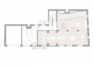
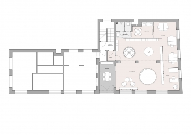
Layout Modifications
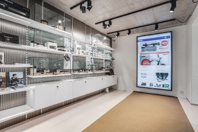
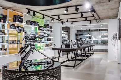
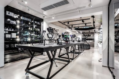
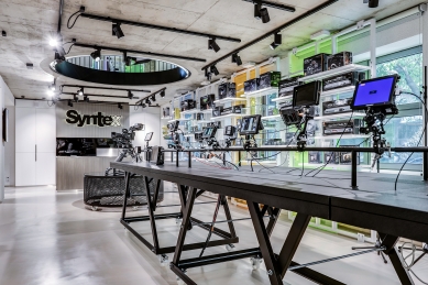
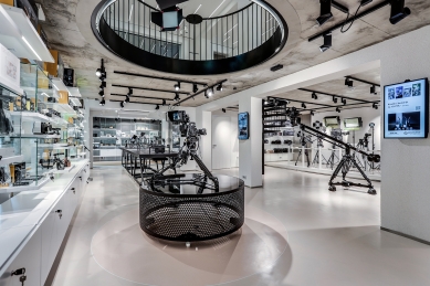
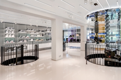
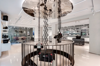
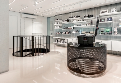
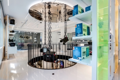
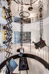
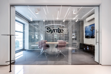
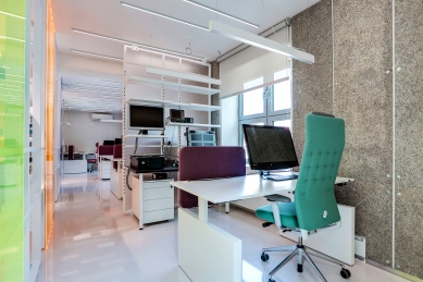
From the ground floor, we decided to allocate maximum space for the showroom, an optimal solution from the perspective of easy access for clients. We retained a smaller portion of the ground floor for a utility store, which retained direct access from the courtyard and connection to the building staircase. Everything had to be enlarged at the expense of the original entrance to the residential units and part of the garages. The removed parking spaces could be compensated for in the courtyard area. We allocated the largest of the residential units upstairs for the administrative part. We ensured the connection between the administrative section and the store with a pair of openings in the ceiling. Through the openings, visual and auditory contact with the store is enabled. A smaller opening accommodates a secondary staircase ensuring quick movement between the store and the administration without needing to use the building staircase. The larger opening serves as a conceptual balcony over the store, as well as an area for presenting hanging lighting fixtures. We connected the warehouse and the store via a side corridor that leads into the showroom outside the main presentation area. We newly opened the entrance to the building staircase to the back part of the courtyard.
Interior Design
The transformation of the existing spaces into a representative sales area consisted of eliminating the negative features of the space. These included the division of the layout into individually constructionally separated rooms, low ceilings, and deep tracts with insufficient daylight.
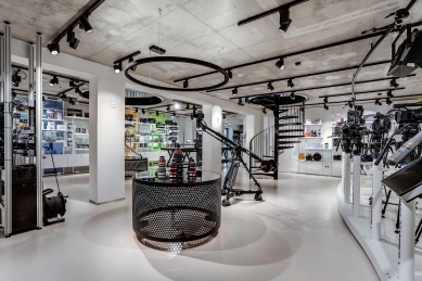
We maximized the opening of the new layout. We created generous openings in the perimeter walls between the wings, and we removed all partition walls except for the separation of the restrooms. To divide the spaces in the administrative section, we only used lightweight transparent elements of a shelving system—sort of screens that separate the area with workstations while still maintaining a sense of unity within the divided space.
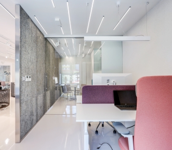
The problem of low ceilings was mitigated using several tricks. For the floors, we used light semi-reflective screeds; similar reflective material was also applied to the ceiling on the upper floor. By leaving the exposed concrete on the ground floor ceiling and creating circular openings, we achieved an interesting contrast between the massive structure and the open vistas, evoking a sense of lightness and contributing significantly to the feeling of spaciousness. The entire illusion of size is complemented by linear and spot lighting elements in the ceiling area.
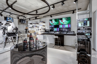
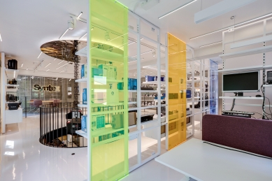
To maintain contact with daylight and the outside nature, we decided to treat the exhibition areas in front of the windows as transparent screens with shelves for product displays. The lightweight construction is complemented by sheets of tinted plexiglass. The gentle colors of blue, green, and orange tones enhance the natural colors of the view of green fragments in the exterior.
We supported the low level of daylight with sufficient artificial lighting. Spotlights primarily target displayed objects, while linear flat lighting provides the entire space with a pleasant light level that feels close to a naturally lit interior.
A key theme in the interior design is contrast. The contrast between the rawness of the construction and the precision of the displayed products. The contrast between the roughness and smoothness of surfaces. The contrast between absorbent and reflective surfaces. The contrast between light and dark, between white and black.
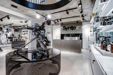
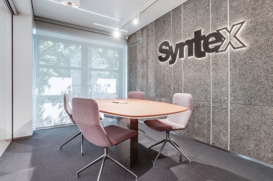
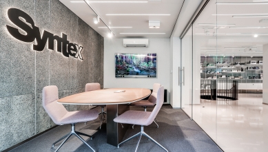
The roughness of the surfaces is evident on the main load-bearing parts of the building, which we coated with traditional cement-lime brizolit plaster and acoustic wall coverings made from heraklit. The load-bearing elements have a robust character in their dimensions and create a calming impression. The heraklit acoustic panels in an unprocessed surface finish give the spaces a less formal character. Individual exhibition elements are executed with the delicacy and precision befitting the displayed products.
In the treatment of the surfaces of the interior elements, we took inspiration from the design of the displayed products themselves. The camera technology is characterized by matte black metal and elements of brushed metal in a natural silver color. Consumer electronics typically have a glossy white surface. We used black and silver elements to accentuate the key elements of the interior and to emphasize the exhibition areas for exclusive products. Everything takes place against a light background.
Conclusion
We managed to transform the originally unattractive space of the shop into a quality commercial exhibition space and a pleasant place to work. An indispensable part of the process was a conscious, accommodating, and patient client who remained steadfast in the demand for an excellent result.
The building was originally designed as an artist's studio situated in a private garden. Over time, with the development and change of ownership, it evolved into a two-story multifunctional building primarily used for residential purposes. The residential units occupied the entire first floor. The ground floor housed garages and a smaller commercial unit. Both commercial and residential units had the same ceiling height of 2.6m, which was unsuitable for commercial use. The layout of the building is divided into two rectangular wings, separated by a staircase. The eastern wing is a double tract divided by a robust system of reinforced concrete columns with beams.
Access to the building is from the adjacent street via a gate. The entrances to the building are oriented towards the courtyard, without direct contact with the street space.
Assignment
The size of the commercial unit gradually became restrictive for operations. At the time when the client approached us, the shop was more of a warehouse than a suitable area for showcasing attractive products. The residential units upstairs were no longer inhabited and served as temporary storage capacity. From an operational standpoint, the separation of spaces was problematic due to the lack of direct communication between the sales area and the warehouse, as well as between the warehouse and the delivery of goods.
However, when starting work on the design, it was very beneficial for us to observe the existing operations and easily respond to apparent deficiencies. In preparation for the assignment, we, along with the client, arrived at the basic requirements from which the design evolved. Increasing the sales area and the area for product presentation. Positioning the administrative part away from the customers while maintaining visual and auditory contact with the shop. Directly connecting the warehouse spaces to the shop while ensuring direct access from the courtyard to the warehouse for product deliveries, and also creating a separate entrance to the remaining unit upstairs.
Layout Modifications
From the ground floor, we decided to allocate maximum space for the showroom, an optimal solution from the perspective of easy access for clients. We retained a smaller portion of the ground floor for a utility store, which retained direct access from the courtyard and connection to the building staircase. Everything had to be enlarged at the expense of the original entrance to the residential units and part of the garages. The removed parking spaces could be compensated for in the courtyard area. We allocated the largest of the residential units upstairs for the administrative part. We ensured the connection between the administrative section and the store with a pair of openings in the ceiling. Through the openings, visual and auditory contact with the store is enabled. A smaller opening accommodates a secondary staircase ensuring quick movement between the store and the administration without needing to use the building staircase. The larger opening serves as a conceptual balcony over the store, as well as an area for presenting hanging lighting fixtures. We connected the warehouse and the store via a side corridor that leads into the showroom outside the main presentation area. We newly opened the entrance to the building staircase to the back part of the courtyard.
Interior Design
The transformation of the existing spaces into a representative sales area consisted of eliminating the negative features of the space. These included the division of the layout into individually constructionally separated rooms, low ceilings, and deep tracts with insufficient daylight.
We maximized the opening of the new layout. We created generous openings in the perimeter walls between the wings, and we removed all partition walls except for the separation of the restrooms. To divide the spaces in the administrative section, we only used lightweight transparent elements of a shelving system—sort of screens that separate the area with workstations while still maintaining a sense of unity within the divided space.
The problem of low ceilings was mitigated using several tricks. For the floors, we used light semi-reflective screeds; similar reflective material was also applied to the ceiling on the upper floor. By leaving the exposed concrete on the ground floor ceiling and creating circular openings, we achieved an interesting contrast between the massive structure and the open vistas, evoking a sense of lightness and contributing significantly to the feeling of spaciousness. The entire illusion of size is complemented by linear and spot lighting elements in the ceiling area.
To maintain contact with daylight and the outside nature, we decided to treat the exhibition areas in front of the windows as transparent screens with shelves for product displays. The lightweight construction is complemented by sheets of tinted plexiglass. The gentle colors of blue, green, and orange tones enhance the natural colors of the view of green fragments in the exterior.
We supported the low level of daylight with sufficient artificial lighting. Spotlights primarily target displayed objects, while linear flat lighting provides the entire space with a pleasant light level that feels close to a naturally lit interior.
A key theme in the interior design is contrast. The contrast between the rawness of the construction and the precision of the displayed products. The contrast between the roughness and smoothness of surfaces. The contrast between absorbent and reflective surfaces. The contrast between light and dark, between white and black.
The roughness of the surfaces is evident on the main load-bearing parts of the building, which we coated with traditional cement-lime brizolit plaster and acoustic wall coverings made from heraklit. The load-bearing elements have a robust character in their dimensions and create a calming impression. The heraklit acoustic panels in an unprocessed surface finish give the spaces a less formal character. Individual exhibition elements are executed with the delicacy and precision befitting the displayed products.
In the treatment of the surfaces of the interior elements, we took inspiration from the design of the displayed products themselves. The camera technology is characterized by matte black metal and elements of brushed metal in a natural silver color. Consumer electronics typically have a glossy white surface. We used black and silver elements to accentuate the key elements of the interior and to emphasize the exhibition areas for exclusive products. Everything takes place against a light background.
Conclusion
We managed to transform the originally unattractive space of the shop into a quality commercial exhibition space and a pleasant place to work. An indispensable part of the process was a conscious, accommodating, and patient client who remained steadfast in the demand for an excellent result.
SKARCH
The English translation is powered by AI tool. Switch to Czech to view the original text source.
0 comments
add comment