Family house Ďáblice

The project became an investigation of the typical suburban plot: adherence to illogical regulations involving roof slopes (form) and the inter-dependence of the automobile (movement). We therefore started with an analysis of movement patterns - interior and exterior - to develop an organizational system regarding form and function. Moreover, we made an early decision to conceive a simple, structural system to minimize costs and maximize spatial flexibility. The result was the creation of two simple rectangles (house+garage), with peripheral structural walls, and a completely free plan for programmatic flexibility. The interior program was traditionally distributed over two floors:
Groundfloor - private garden / south facing orientation
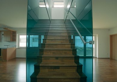
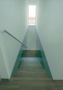
This was conceived as an open layout divided by a centrally placed sculptural stair. All public functions are oriented towards the south garden while the horizontal circulation is loaded to the north, adjacent to the garage. Furthermore, the sculptural stair spatially divides the kitchen/dining from the living room while still allowing visual connection through openings and use of transparent materials.
First floor - public park / north facing orientation
It reverses the circulation diagram of the ground floor. All private functions are oriented towards the quiet, northern park while the horizontal circulation is loaded on the south side. This corridor visually connects you to the exterior with the use of strategic windows defining important view corridors.
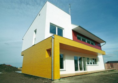
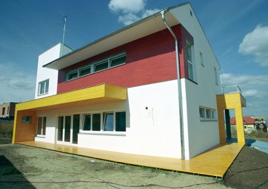
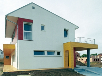
The exterior of the house is a reflection of the interior diagram the circulation is delienated by red wood cladding while the rest of the program in white plaster - and is augmented by an exterior system of canopies and decks delienated by yellow wood cladding which express the movement of people, cars and light around the house. The imposed sloped roof accommodates the diagram as well: asymmetrical sloped roof reacting to internal first floor movement, and shed roof expressing the hierarchical role of the master bedroom.
 |
16 comments
add comment
Subject
Author
Date
komplikované řeči
A.J.K
07.07.06 01:51
Proč vám připadá dům špatný?
Martin Rosa
07.07.06 09:51
..
ondrejcisler
07.07.06 10:03
Komplikované řeči II.
Daniel John
07.07.06 11:37
Komplikované řeči III.
Michal Schwarz
07.07.06 04:46
show all comments


