
Grid tectonics: When the seam ceases to be invisible
09.04.2026 00:05
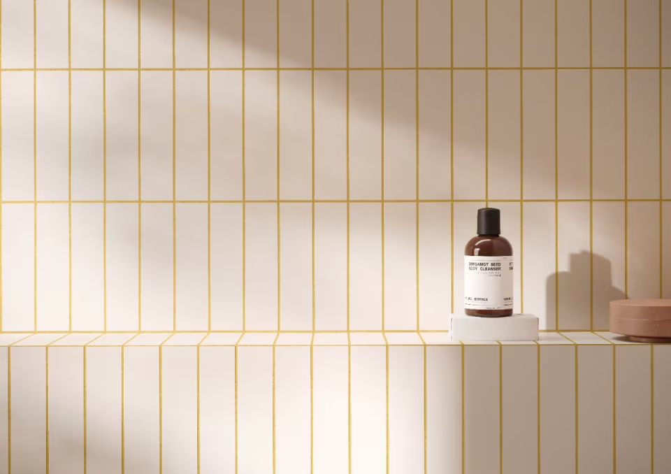 |
In precision interior design, there are no secondary roles. Even the smallest detail, such as the width and color of the grout line, can fundamentally transform the scale, rhythm, and perception of the entire volume of space. For an architect, grout is not merely a functional filler to eliminate stress. It is a graphic element that defines whether the wall will appear as an infinite monolith or as an acknowledged geometric composition.
The modern bathroom is no longer just a utilitarian space; it is a sanctuary where haptic and visual tranquility take center stage. The right choice of grout is therefore a critical decision that either supports the architectural intent or irreversibly shatters it.
Monochromy as a Manifest: The Power of "Blending"
In recent years, the trend of visual unity has dominated global design. A technique known as blending (or tone-on-tone) suppresses the grid and lets the texture of the material itself speak. Grout that color-accurately absorbs the shade of the tile creates the illusion of integrity. This approach is essential for large-format ceramic slabs and natural materials, where any contrasting element acts as visual noise.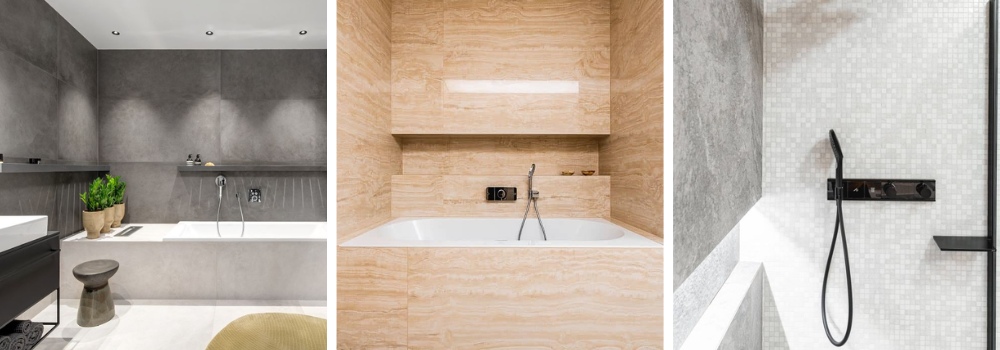 |
How profoundly this unity can influence the mood of the interior is demonstrated by this 3D bathroom design, where color defines the atmosphere. Here, the grout does not create a barrier but becomes an organic part of the colored surface, which visually enlarges the space and brings tranquility to it.
Graphic Character: Acknowledged Geometry
At the opposite pole stands conscious contrast – the so-called popping. A pronounced grout line can turn even a classic tile into a distinctive statement. The contrast emphasizes the craftsmanship of the arrangement, highlighting patterns like herringbone or vertical bonds, and brings dynamism to the space. It is a bold play with perspective that requires absolute precision in execution – any millimeter of deviation is immediately acknowledged in the contrasting grid.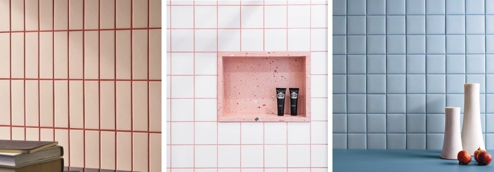 |
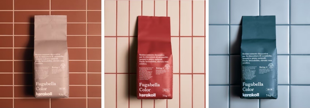
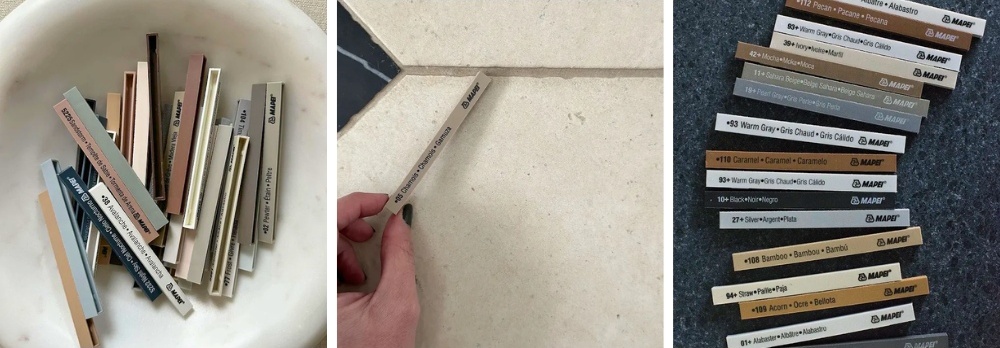
Material Intelligence: Kerakoll and Mapei in the Hands of Professionals
At Keraservis, we understand that for an architect, color is as important as physical properties. That's why we work with technologies that push the boundaries of material chemistry:- Kerakoll Fugabella Color: An Italian icon designed by designer Piero Lissoni. This "resin-cement" (a hybrid of resin and cement) offers 50 shades with incredible depth and a matte finish. Its colors are designed to naturally complement modern tile pigments, making it an ideal tool for tone-on-tone projects.
 |
- Mapei Ultracolor Plus: The industrial standard where aesthetics must go hand in hand with extreme durability. Thanks to BioBlock and DropEffect technologies, grouts remain hygienically clean and color-stable even in high humidity exposure.
 |
3 Pillars for Flawless Specification
For an architect's vision to survive everyday operations, three aspects that are often missing in projects must be considered:- Light Influence: The pigment of the grout reacts to the chromaticity of the lighting. Always sample in the actual conditions of the building.
- Surface Scale: The width of the grout directly affects the saturation of the color in the area. In mosaics, the grout becomes the dominant color of the wall.
- Detail Durability: Even the most beautiful light grout requires proper maintenance. To preserve its appearance, educating the client on how to clean grout without damaging its structure is essential.
Consultation as Part of the Creative Process
Architecture is a dialogue. In Keraservis showrooms in Brno, Prague, and Ostrava, you will not only find samples but also partners for your projects. We will help you align colors, technical limits, and material chemistry so that your authorial intention remains pure and lasting.The English translation is powered by AI tool. Switch to Czech to view the original text source.
0 comments
add comment
Related articles
0
17.09.2025 | Outdoor paving and garden showers: Premium inspiration for a modern exterior
0
01.07.2025 | New bathroom showroom in Prague: endless inspiration, over a thousand displayed samples, and bathroom designs right on site
0
28.04.2025 | Showrooms of bathrooms Keraservis: Creative laboratories for architects, developers, and designers